LMBD
LMBD is a well-know Belgian law firm that desired a new brand identity. For us an exciting challenge!
New identity
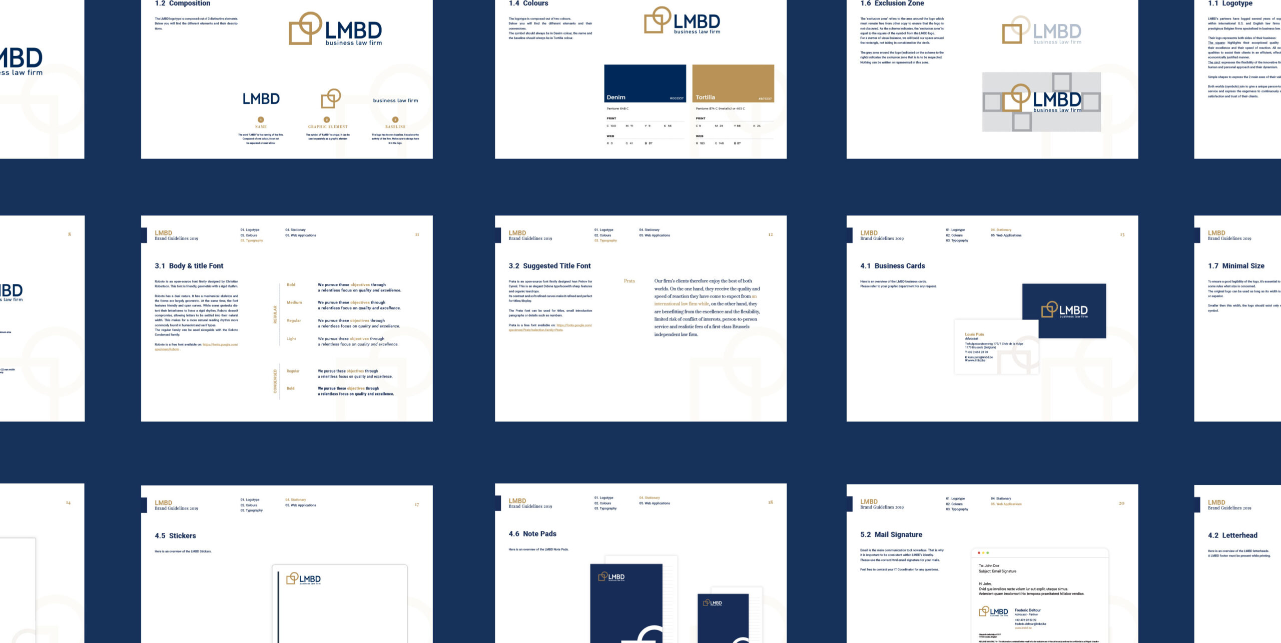
LMBD has been around for quite a while, they have accumulated many years of experience in American, English and prestigious Belgian law firms. Our mission was to update and rebrand the look and feel of their business starting with their logo. A challenging mission given the industry sector. After many sketches and research we created a simple and pure logo. The square symbol is masculine and represents the rigid, complex and structured part of aw, with all its rules and theories. The square represents order, stability and rigor. While the round, organic, more feminine and more modern circle symbol, represents the human side of law, equally evoking movement and positive change. These 2 overlapping shapes create what LMBD is about.
With style
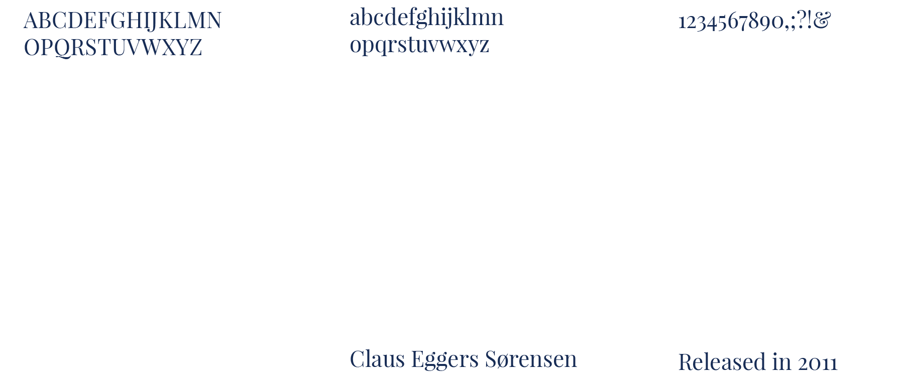
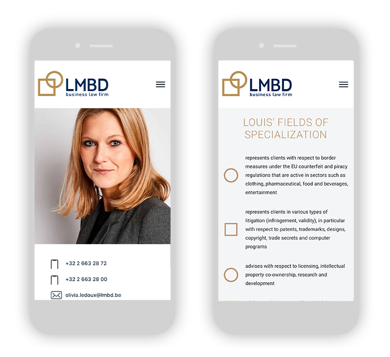
Both notions are represented equally in the new LMBD house-style. We tried to go for beautiful typographic combinations, linking the sober and traditional typos to modern and avant-garde ones. The navy blue is a reassuring color and got matched with a rich copper color, full of energy and prestige. Visuals are colored with a predominance of blue.
Divinity of mythology
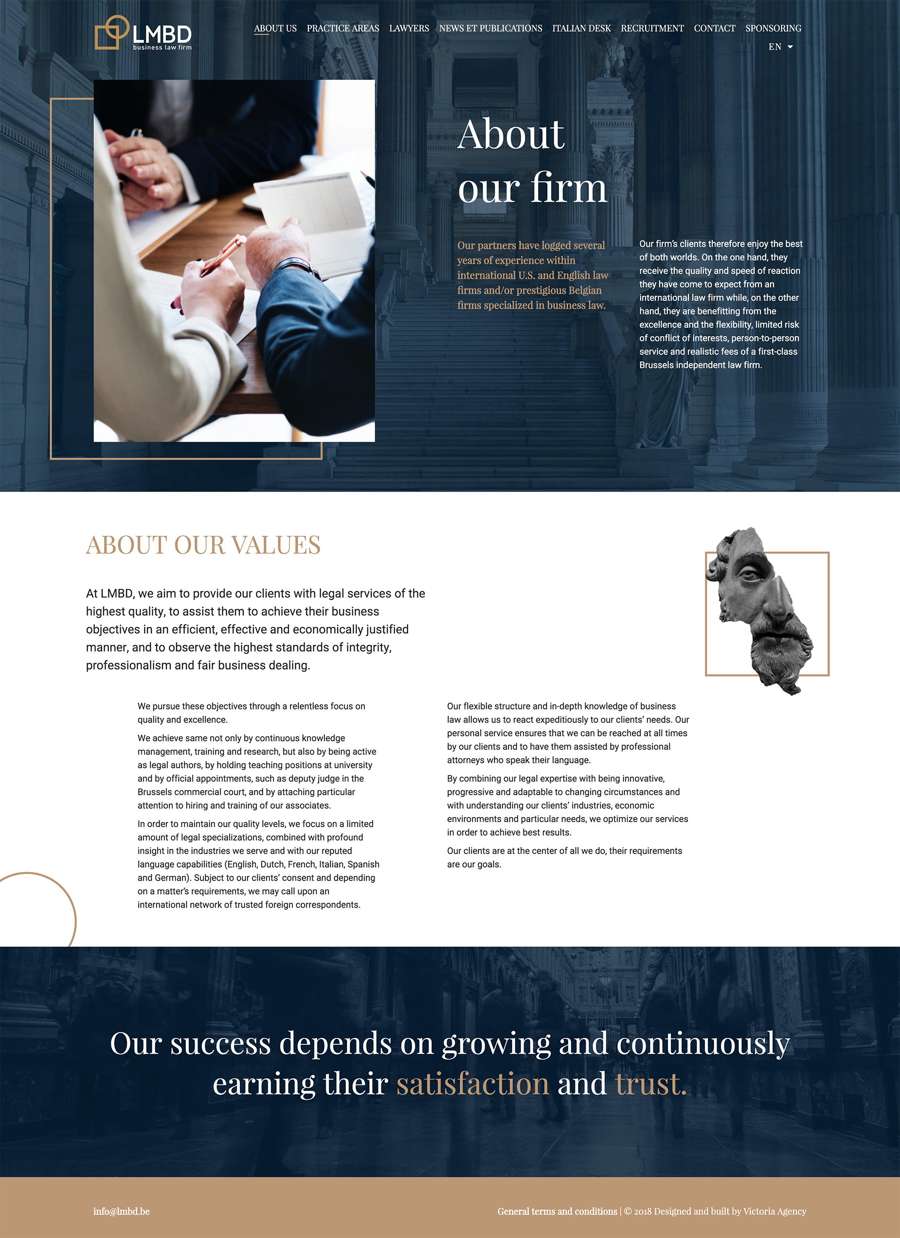
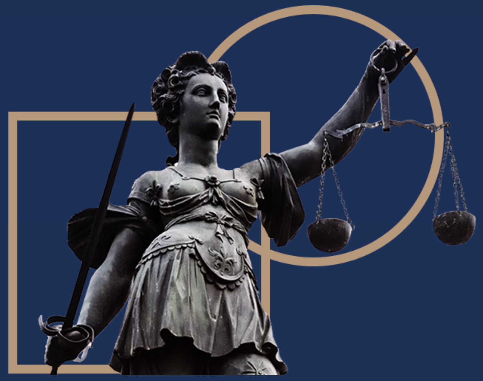
Justitia is the goddess of Justice in ancient mythology. This reference to the past and the history of justice was very important to us in the story-telling of LMBD. For this reason, we used on the website different visuals representing Greek mythology figures associated with the shapes of the logo. Again a perfect mariage between old and new.
Print is not dead
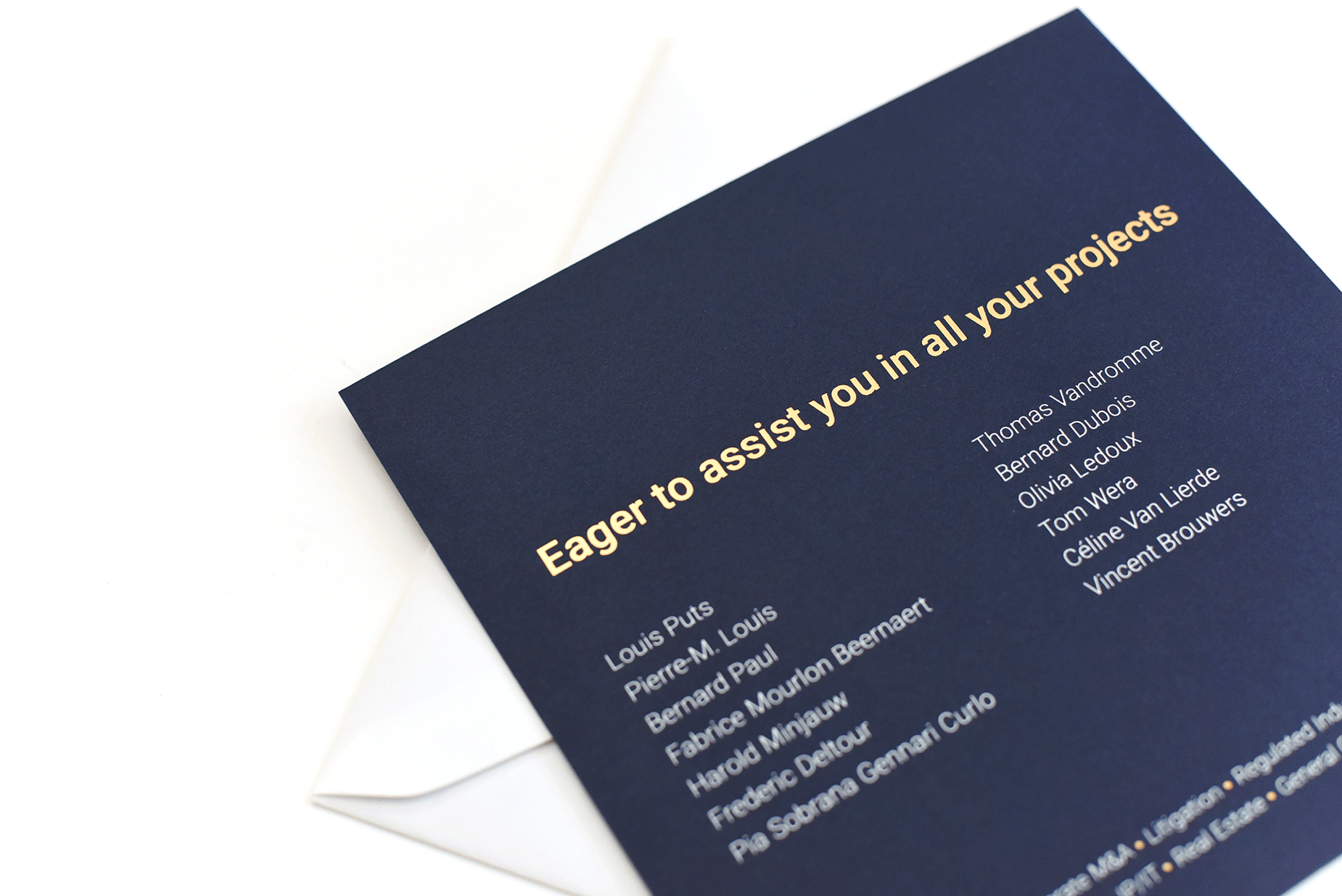
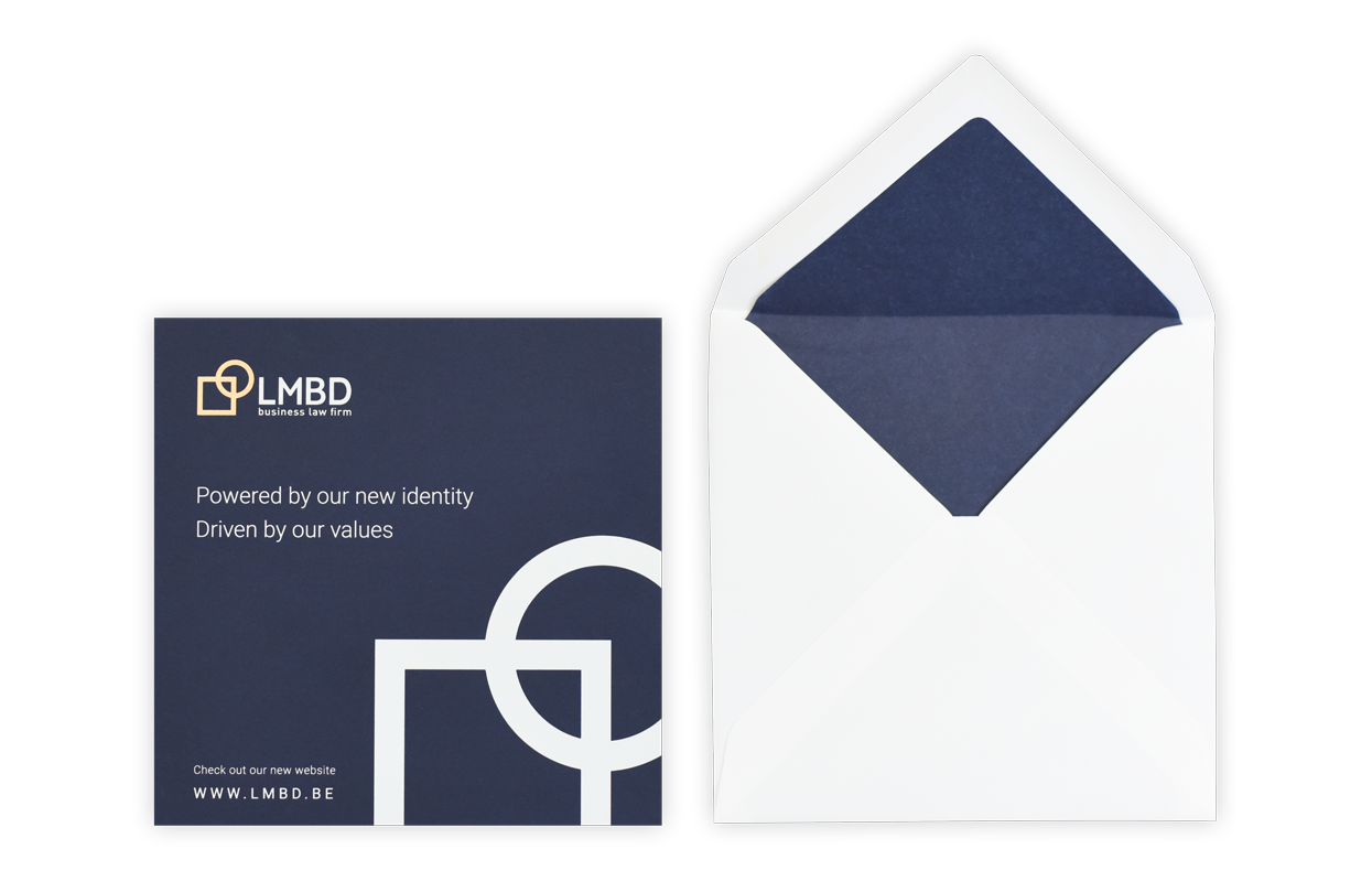
We have also developed all their stationery and other branded supports. LMBD new year card 2019 was there to introduce to their client their new identity and their team members. White and copper printed on a fine dard blue paper made it precious but festive.
Excellence and Flexibility, that’s what we stand for!
